 I have not kept it secret that I’m a fan of solar power. Leaving storage hangups aside for now, the fact that the scale of available power is comfortably gigantic, that perfectly efficient technology exists, that it’s hard-over on the reality axis (vs. fantasy: it’s producing electricity on my roof right now), and that it works well almost everywhere—what’s not to like? Did you trip over that last part? Many do. In this post, we’ll look at just how much solar yield one may expect as a function of location within the U.S.
The ancient Mayans laboriously accumulated a substantial set of observational data on solar illumination across America well ahead of the present need. Okay, it wasn’t actually the ancient Mayans. It was the National Renewable Energy Lab (NREL), who embarked on a 30-year campaign beginning in 1961, covering 239 locations across the U.S. and associated territories. Imagine this. How many people were even cognizant of solar power in 1961? Yet the forward-thinking scientists at NREL appreciated the value of a solid baseline dataset way back then. This level of foresight seems akin to the Mayans constructing a calendar going all the way to 2012. That’s all I’m saying. It’s a gift from the past.
I have often consulted and enjoyed the product of this work over the years—called the NREL Redbook, or more formally, the Solar Radiation Data Manual for Flat Plate and Concentrating Collectors. But with a snazzy blog post as motivation, I have taken it up a notch and produced a variety of graphical representations of the dataset to explore what it can tell us. Let’s begin the guided tour.
What’s in the Dataset?
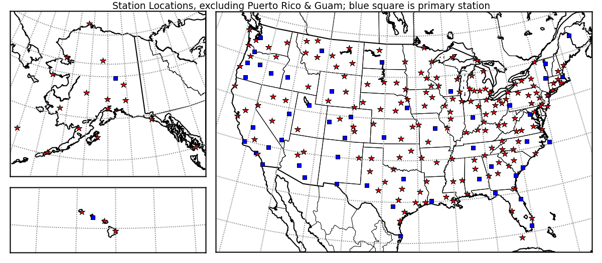
In 1961, various sensors were installed in 56 locations distributed throughout the U.S. to measure solar illumination on an hourly basis. Measuring both diffuse and direct sunlight, it is possible to reconstruct what a flat panel (or concentrating collector) will receive in a particular orientation. In addition to the 56 “primary” stations, 183 “secondary” locations contributed meteorological measurements—including cloud cover—which were bootstrapped into the dataset by modeling the solar illumination. The map below illustrates the locations of the stations, leaving out the two stations in Puerto Rico and Guam.
A word about these maps before we go on. They are all equal-area projections (Albers), and each panel is scaled correctly relative to each other. Grid lines are at 5° intervals. All are generated via Python using matplitlib and Basemap. They are each 1200 pixels across, and may benefit from clicking to view full-size.
The original hourly data would be a bit unwieldy (though I do have an appetite for data, and may someday track down the full dataset). So instead, the Redbook presents monthly averages of daily energy accumulation measured in kWh/m²/day.
Because the “standard sun” deposits 1000 W/m² under clear conditions, the kWh/m²/day metric conveniently maps to the equivalent number of full-sun hours one receives per day. For example, typical locations in the U.S. average about 5 kWh/m²/day over the year for a flat panel facing south and tilted to the site latitude. This means about five hours of full, direct sunlight is normal. Of course, the sun is up longer than five hours (in fact, the yearly average is 12 hours, anywhere on Earth, neglecting refraction effects near the horizon). But factor in geometry and clouds, and we get down to 5. By geometry, I mean that the sun is not always directly in front of the panel. When the sun is near the horizon, the illumination of the panel is oblique, so that the panel effectively is foreshortened and has a geometrically reduced cross section for capturing the sun’s rays. A tracking mount removes most or all geometrical considerations, leaving only clouds and atmospheric transparency as factors.
Back to the dataset, which presents monthly averages of daily yields, together with an annual average, for a variety of panel orientations and tracking possibilities. Because the study spanned three decades, it is also possible to report meaningful minima and maxima for each month in each panel configuration.
Below is a sample for St. Louis, MO. Why do I pick St. Louis? Because it is (or was until 2008) a political bellwether state for presidential elections? Because Missouri is the “Show Me” state, and the scientist in me resonates with this attitude? Because it’s the Gateway to the West, where the killer solar potential sits? Well, all these are fine reasons, but really it’s because when I sort the list of stations based on virtually any measure, St. Louis always turns up right there in the middle of the list, making it a happy median.
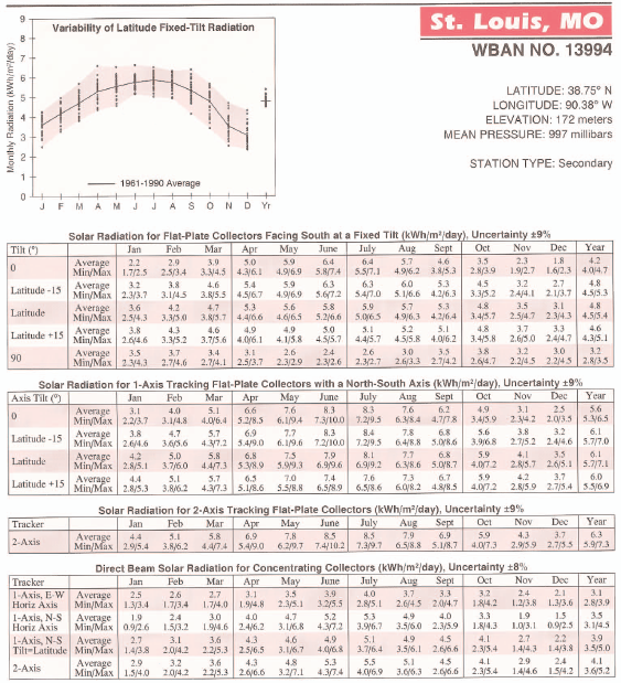
Available from the Redbook site.
Dissecting the page, location information and station type appear at upper right. At upper left, we see a plot of the annual pattern of illumination onto a flat panel oriented toward the south and tilted at the site latitude. A dot appears for every month in the 30-year campaign, and a pink slug indicates the full range of variability. On the right-hand side of this plot is a cluster of points indicating the yearly average yield.
Next are four blocks of numbers for:
- A fixed panel facing south, tilted to various degrees
- A panel tracking on a single north-south axis, either horizontal or tilted to various degrees
- A panel tracking the sun perfectly (2-axis)
- Concentration yield for various tracking schemes on one or two axes
I clipped out the final block of monthly climatic conditions in the image above.
For each block, the monthly averages and minima/maxima are presented, the annual average appearing at right. This page represents summary statistics, but monthly values spanning 360 months are also available.
What Can We Learn?
Using the St. Louis data as an example, what can we make of all these numbers?
Let’s say you buy a panel and want to know how to get the most from it. If you don’t want to mess with tracking, then according to the St. Louis data it hardly matters how you tilt the panel, so long as it’s within 15 degrees of site latitude: you’ll get an annual average of 4.6–4.8 full-sun-equivalent hours per day. But if you want more constancy throughout the year, the latitude-plus-15 solution is better. You’d sacrifice 4% on the annual average (4.6 vs. 4.8), but the variation throughout the year is from 72% to 113% of the average (3.3 to 5.2), whereas if we went for latitude-minus-15, we’d see 56% to 131% variation (2.7 to 6.3). Of course the variation in both cases is bigger if considering minima and maxima instead of the monthly averages over 30 years.
Tracking and Concentration
What about tracking? One-axis tracking (much simpler than dual-axis tracking) buys a 27% boost over a fixed panel (6.1 vs. 4.8). Is it easier and cheaper just to buy 27% more panels and avoid tracking complications? Often it will be. Going to a full-up 2-axis tracker buys only 3% over the 1-axis tracker (6.3 vs. 6.1). That’s because a 1-axis tracker with the rotation axis tilted at the latitude angle and facing north (thus parallel to the Earth’s axis of rotation) will never see the sun more than 23.5° away from the panel direction. The cosine projection of a 23.5° offset then results in capturing 92% of the light that a perfectly-pointed panel would see—and this is the worst-case projection, around the solstices. On average, the effect drops to something like a 4% loss, in rough agreement with the 3% number pulled out of the NREL data. One-axis tracking will generally see greater seasonal variation than the fixed-panel analog, due to much-improved performance in the summer.
If you want to do concentrated solar power, Missouri might not be the ideal place. At its best (2-axis tracking; and tracking is vital to concentration), we only get 85% as much as we would from a fixed panel (4.1 vs. 4.8). Of course, this compares area of the concentrator to area of the panel. If the concentrator is dirt-cheap compared to panels, it could turn out to be a better route. But tracking will always increase complications, cost, and maintenance issues. Concentration (and thus solar thermal) strongly favor the cloudless skies characteristic of desert locales.
Inferring Weather
Somewhat more interesting is to compare 2-axis tracking in the flat panel vs. concentration cases, since geometrical factors are removed and we are left with a sense of how much direct sun is available at a site. In St. Louis, the concentrator pulls in 65% of what the flat panel would (4.1 vs. 6.3). This says that 65% of the light hitting the tracking panel in St. Louis is from direct vs. indirect sunlight. When clouds are in the way, concentrators become virtually useless, while the flat panel still enjoys diffuse light from the bright cloudy sky. Because direct sun generally delivers more light than its diffuse counterpart, we can say that the skies over St. Louis are cloudy more than 35% of the time during daylight hours. On a monthly basis, we can ascertain that October is the month with clearest skies (69% of light from direct sun), while May is the cloudiest (62%). Not a great deal of variation, actually.
So that’s a snapshot of the type of information available in the NREL Redbook. Now let’s expand our scope beyond the midwest.
Comparing Sites
I copy below a table that appeared in an earlier post. The table represents the best location in the NREL database (Dagget, near Barstow, CA), St. Louis as a typical place, the worst place in the continental U.S. (on the Olympic Peninsula), and a few extras for flavor. For each location, three modes are considered: flat panel tilted at latitude (typical situation); flat panel with 2-axis tracking of the Sun; and concentration employing 2-axis tracking. For each mode and location, three daily-average numbers are given: worst average month—yearly average—best average month.
| Location | Fixed Tilt | 2-axis Tracking | Concentration |
| Dagget, CA | 5.2—6.6—7.4 | 6.8—9.4—12.0 | 5.4—7.5—9.7 |
| St. Louis, MO | 3.1—4.8—5.9 | 3.7—6.3—8.5 | 2.4—4.1—5.5 |
| Quillayute, WA | 1.5—3.4—4.8 | 1.7—4.4—6.8 | 1.0—2.6—4.0 |
| San Diego, CA | 4.6—5.7—6.5 | 5.9—7.4—8.9 | 4.5—5.3—6.3 |
| Fairbanks, AK | 0.3—3.3—5.6 | 0.3—4.7—8.7 | 0.3—2.9—5.3 |
The thing that’s always impressed me most about the NREL dataset is the fact that the worst location in the continental U.S. is only a factor of two worse than the best solar location. Intuitively, I would expect the Mojave Desert to outperform the Olympic Peninsula rain forest by leaps and bounds. But a meager factor of two! Even Fairbanks, Alaska performs well on the yearly average metric.
On to the Graphs
Enough with the tables of numbers. Let’s look at some graphical results.
Fixed Panel, South at Latitude
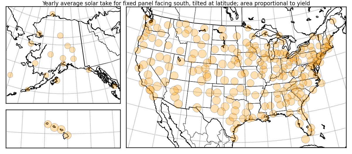 Above is a graphical representation of the yearly averages from each of the stations. The area of each circle corresponds to the solar yield, so at a glance we can compare relative performances across the country. If your brain works like mine does, the shocking thing is how similar all the circles are! Are they really different in size? At a glance, it’s hard to identify cruelly disadvantaged sites. On closer inspection, we can tell that the Pacific Northwest coast has smaller dots than the Desert Southwest. And the Alaskan spots are smaller than most (same map scale, so direct comparisons valid). But mostly I see a lot of suns out there, folks.
So my question to you is: Are you thinking right now that your location may be better for solar than you thought before reading this post?
Let’s invert the question to ask how large the solar array would have to be to deliver the same annual energy as a function of location.
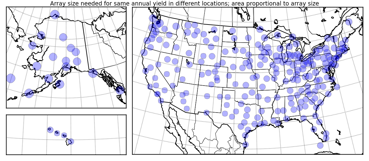 Same story from a different perspective: the array size (cost) does not look grossly different no matter where you go. Note that this is not the area of solar collectors needed for each region: those dots would generally be too small to see! Rather, it’s just the relative size in each location to deliver the same amount of annual energy.
Yearly Variation
Yearly averages are nice as a composite number, and is the most relevant metric for the ubiquitous grid-tie systems taking advantage of annualized net metering. But for stand-alone installations, unless your electricity use correlates with summer (as may be the case for air conditioning, refrigeration, or pumping water for irrigation), the system needs to be sized based on the poorest monthly performance rather than the annual average. If we had long-term storage (liquid fuels would be nice), we could ignore seasonal variations. Unfortunately, that’s not where we are—right now or in the foreseeable future.
So how does a fixed panel—pointing south and tilted to site latitude—perform across the year? I’ve got just the graphic for you.
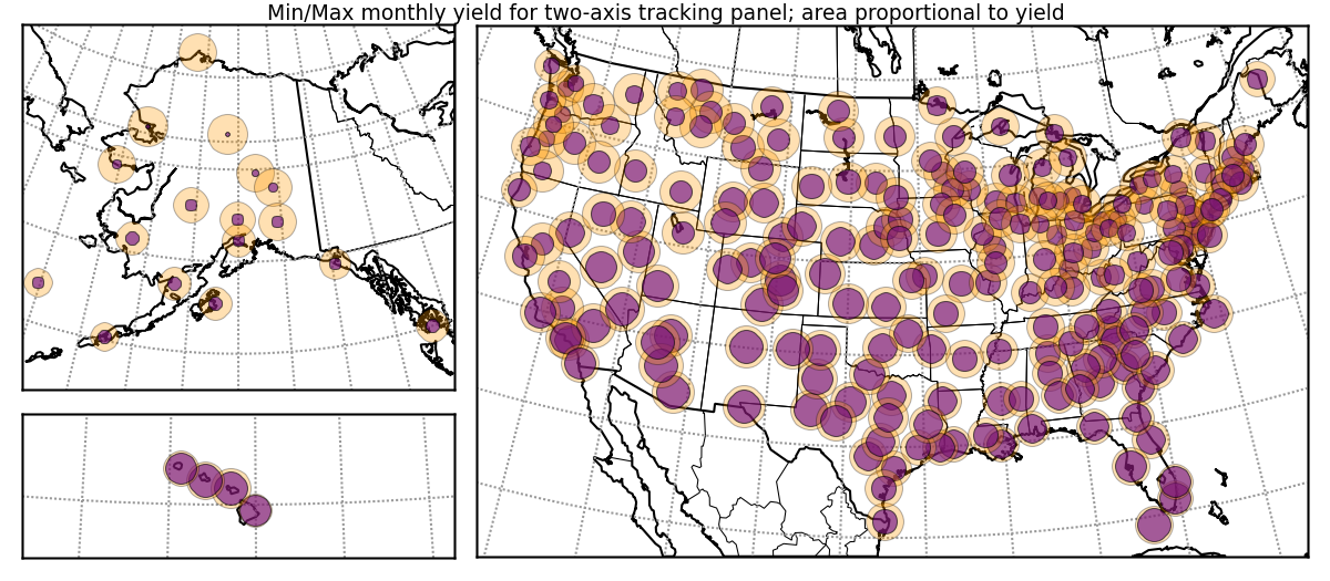
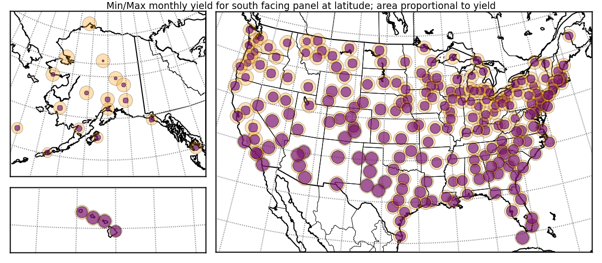 Now we have circle areas sized to reflect the maximum-yield month (can be different months for different sites) and the minimum-yield month (most commonly December). So what pops out? The Texas panhandle is remarkably steady year-round. Don’t try to hawk your giant battery banks there! Head to the Pacific Northwest coast for that, where the variation is far more pronounced. Latitude clearly plays a role in stomping on winter performance, but it’s not all there is to the story. Note that Montana and the Dakotas outperform the Great Lakes region in winter despite a higher latitude.
Alaska is a whole different story. Huge variations. Forget about reaping much sunlight in December near the Arctic Circle (nada at Barrow, the northernmost point in the sample). On the flip side, the long summer days make these locales comparable to many summer sites in the lower 48. And this even with a south-facing panel missing a lot of the fun when the rising and setting sun slip well to the north, behind the panel.
Solar Extremes
The fixed panel minimum/maximum is perhaps a very practical representation given the ease and predominance of this mounting option. But if we look instead at the two-axis (non-concentration) tracking, we get to ask how much the actual sunlight varies at a site. A fixed south-pointing panel misses substantial sunlight opportunities in the morning and evening around summer solstice, when the sun is north of the east-west line.
The winter-time performance is not substantially enhanced by tracking, especially for higher latitudes where a south-facing tilted panel is well situated to take in the whole show. But the summertime gain can be substantial. This has the effect of modestly enhancing aggregate yearly yield, but also results in larger variations throughout the year.
A Look at the Weather
We can play the same game we did for St. Louis in regard to evaluating direct vs. diffuse light by comparing the two-axis tracking results with and without concentration. Here I restrict attention to the months of December and June for all locations, and for each month form a ratio of concentration yield to flat panel yield (concentration is always less per square meter of collector vs. panel). I make an outer circle for June (sized the same for all locations) and an inner circle for December (also of uniform size). The grayscale indicates the degree of cloud opacity: darker is cloudier. For high-latitude stations in Alaska, I ignored points for which the daily average yield came out to 0.5 hours or less, opting instead to turn these winter interiors fittingly black.
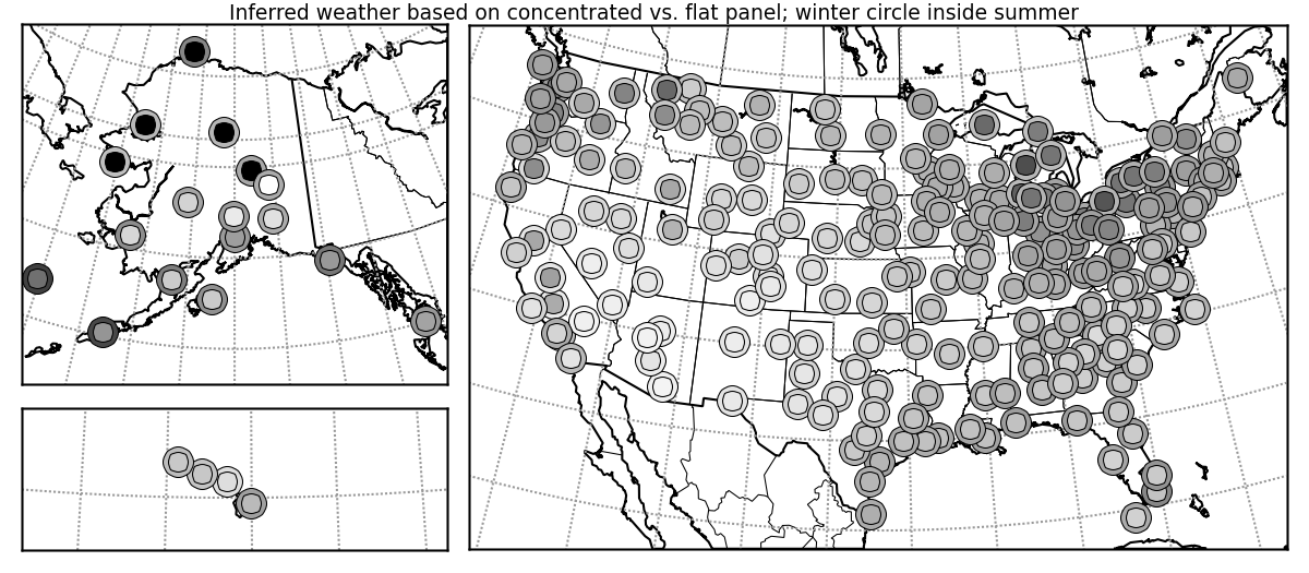 The view is interesting, I find. Dark on the outer annulus means a higher prevalence of clouds in the summer, while dark in the middle means cloudy winters. Seattle measures the same for both. Winters around the Great Lakes appear to be darker than those in Seattle (Erie, PA and Traverse City, MI are the standout dark ones). The Southeastern U.S. shows the signature of summer storms. San Diego and Los Angeles are sunnier in December than in June due to the “June Gloom” marine layer. Alaska tends to have cloudier summers than winters. Hawaii, as in most measures, is pretty constant year-round.
But as interesting as this plot might be, don’t let it be the deciding factor about whether a location is amenable to solar power. The previous maps are far better suited for that evaluation, addressing the solar potential directly. For instance, the statement above that it is sunnier in San Diego in December than in June does not translate into greater solar potential in December than June: the days are shorter and the sun at a lower elevation. It’s just that the fraction of daylight hours that the sun is directly visible is greater in the December than in June in San Diego.
Sizing for Variability
Thirty years of good data is a wonderful thing. The bad years and the good years are well represented. And three decades is a timescale commensurate with the likely lifetime of a photovoltaic (PV) installation.
In sizing a PV system, we could do the easy thing and base the size on the yearly average value for the appropriate panel orientation. But variability will mean underperformance in winter and overabundance in summer. On an annualized net-metering scheme for a grid-tie system, this is perfectly peachy, and one needs go no further.
As a case study to see if this whole NREL business is really a useful predictor, I can use performance measurements from a friend’s grid-tie system here in San Diego. The system has a nameplate capacity of 2592 W: 12 panels rated at 216 W each (based on 1000 W/m² input at 1.5 airmasses and 25 °C). The inverter efficiency and other minor losses put the AC rating at 2267 W (87.5% efficient). Over the last year, the system generated 4447 kWh, amounting to an average of 5.35 hours of full-sun-equivalent per day. The panels face south at a modest inclination of about 12°, so we would expect a performance somewhere between the average San Diego values of 5.0 hours for 0° (horizontal) orientation and 5.6 hours for latitude-minus-15° (17.8° tilt). Given year-to-year variations, we land close enough to the mark for me!
But what if you’re trying to satisfy a monthly net metering scheme, or—like me—you aim for off-grid performance using batteries and don’t have seasonal-timescale storage?
That’s where the monthly database comes in handy. For a given location and panel orientation, we can assess how often a month will come along dishing out a performance lower than some threshold. I like to frame said threshold as an “overbuild factor.” In other words, if the array is sized strictly according to the yearly average, one might expect it to underperform about half the time, so that we should scale up the system by some factor to cover the weaker periods. The greater the downward variation, the larger the overbuild factor must be.
For instance, let’s look at a panel tilted at site latitude for St. Louis. The yearly average is 4.8 full-sun equivalent (FSE) hours per day, but in December we only expect 3.1 FSE hours on average. So we could overbuild the nominal system by the factor 4.8/3.1 = 1.55×. Yet the worst December in the period from 1961–1990 resulted in only 2.3 FSE hours per day, so perhaps we should overbuild by 4.8/2.3 ≈ 2× to be “30-year safe.”
More usefully, we could turn the data into a frequency-based analysis via curves like the following.
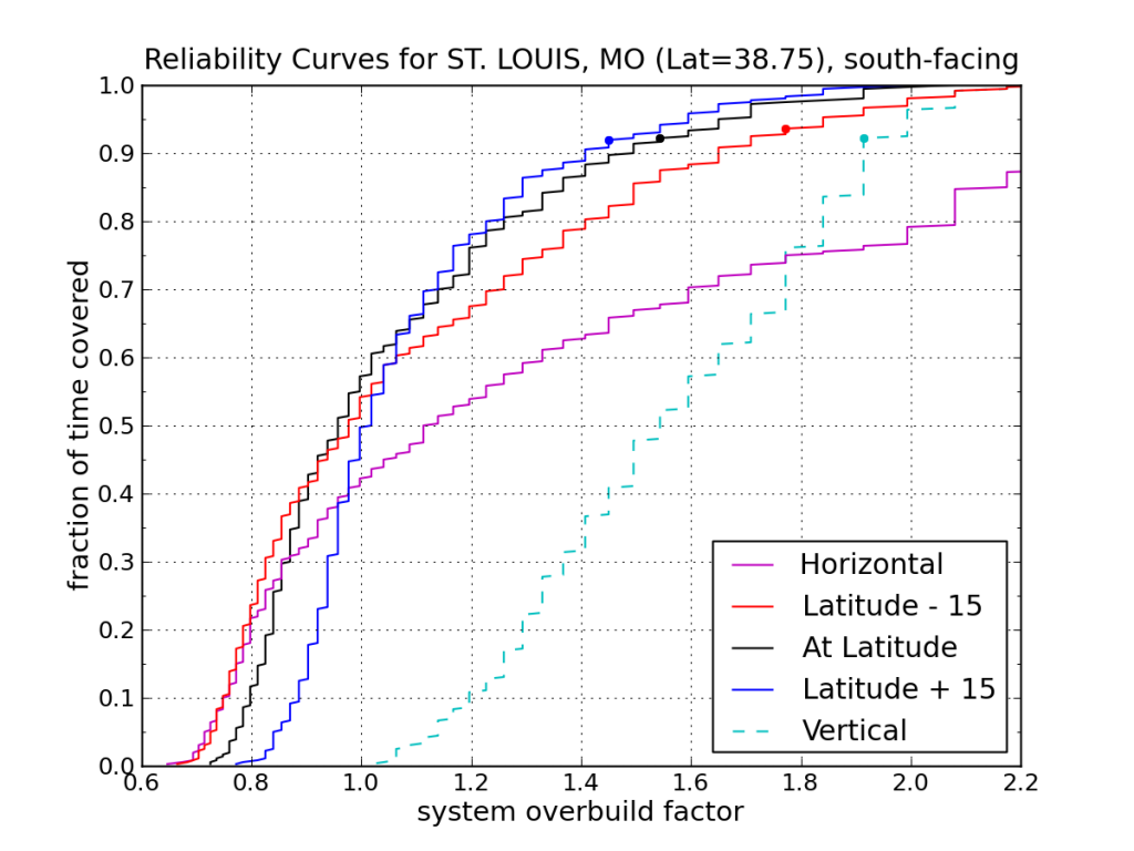
Indeed, for the black curve, representing a panel tilted to the site latitude in St. Louis, we see that in order to be 100% covered, we need a factor of 2 overbuild. But we can still get 95% coverage by lowering the system size to 1.7× or so: a 15% reduction in system size costs only 5% in reliability. 90% reliability needs only a 50% overbuild (1.5×).
Other curves are represented on the plot corresponding to different panel orientations, and all are referenced to the latitude-tilt yearly average. In other words, let’s say we decide we would need a 2.0 kW PV system tilted at latitude to satisfy our annual average energy need in St. Louis. If we then tighten the requirement to monthly performance and demand adequate solar resource 90% of the time, we would have to scale up the latitude-tilted system by a factor of 1.5 to 3.0 kW to meet our quota. But if we tilted the system to latitude-plus-15°, we can install a slightly smaller system (2.8 kW) and achieve the same effect. Other choices are not as favorable in this case, although by the time we get up to a 4.0 kW system (2× over-build), four of the five panel orientation choices are meeting the need.
Dots point out the reliability you’d get by using the worst monthly average (rather than minimum) for the panel orientation in question. For example, at latitude-plus-15 in St. Louis, the worst month gets 3.3 FSE hours, which compared to the tilt-at-latitude average of 4.8 suggests an overbuild of 1.45, which it turns out will provide adequate monthly energy 92% of the time.
The curves are “steppy” because the database values are rounded to one decimal place in kWh/m²/day (or FSE hours). The height of a step is an indication of how many months of the 360 months in the study produced that same performance.
Now let’s look at some other cases.
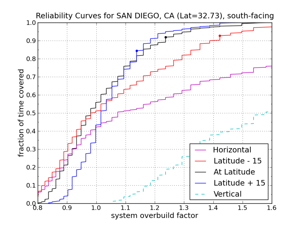 In San Diego, the near-constancy of weather means we can get 90% reliability with just a 20% over-build, or nearly full reliability with a 50% over-build—provided the panels are tilted at latitude or a little steeper. Vertical panels are not so useful.
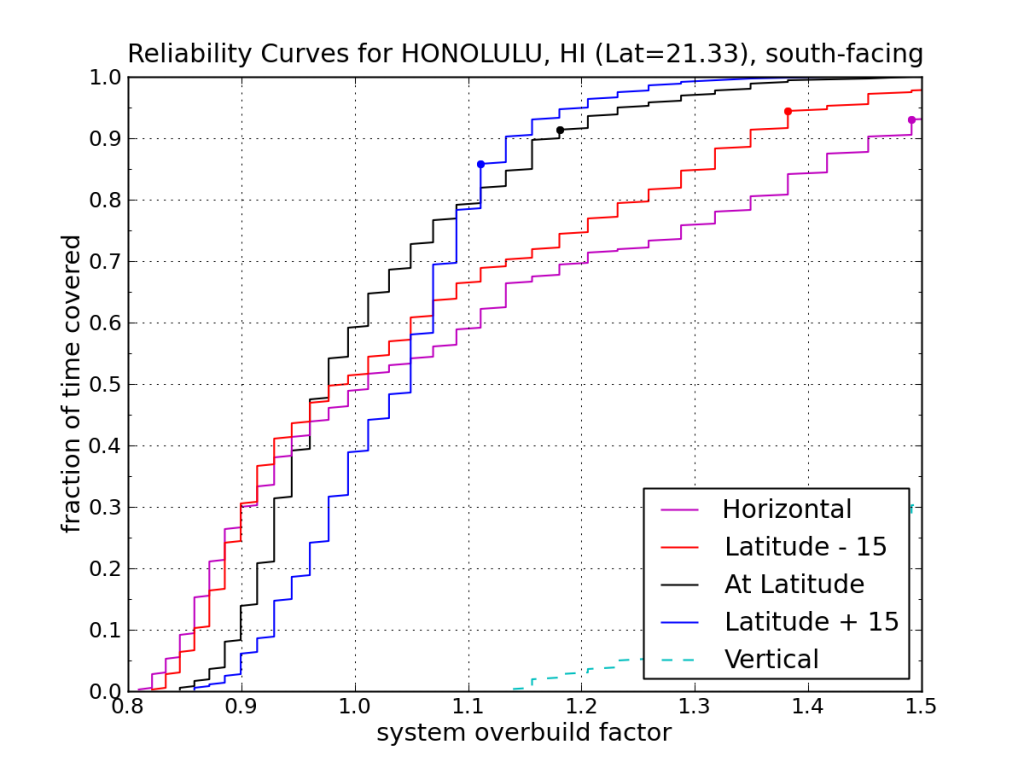 In a similar vein, the constant conditions of Honolulu tolerate even smaller overbuild factors for covering unusually bad months. At this latitude, a south-facing vertically-oriented panel is just plain stupid.
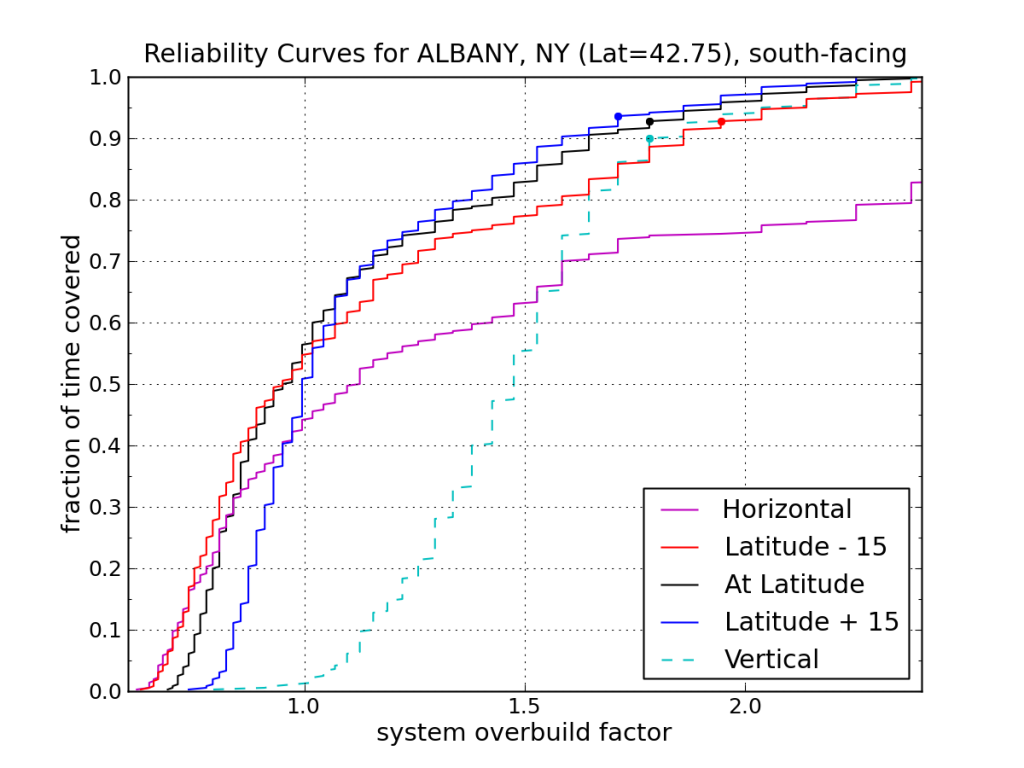 Let’s head to New York State, where we find slightly higher overbuild requirements than in St. Louis (plus, the baseline number of average sun-hours per day will be smaller). The latitude-plus-15° case again edges out the other choices, although all but the horizontal orientation converge by the time we exceed 90% reliability.
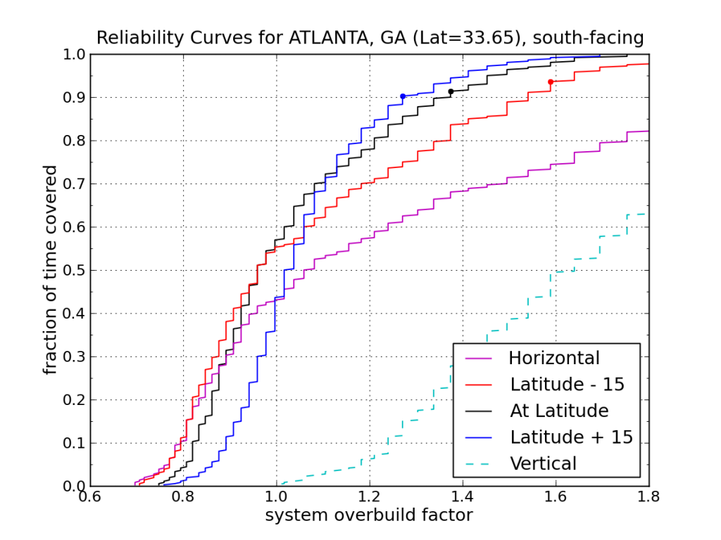 In Atlanta, a 50% overbuild puts you in good stead for latitude and latitude-plus-15° tilts.
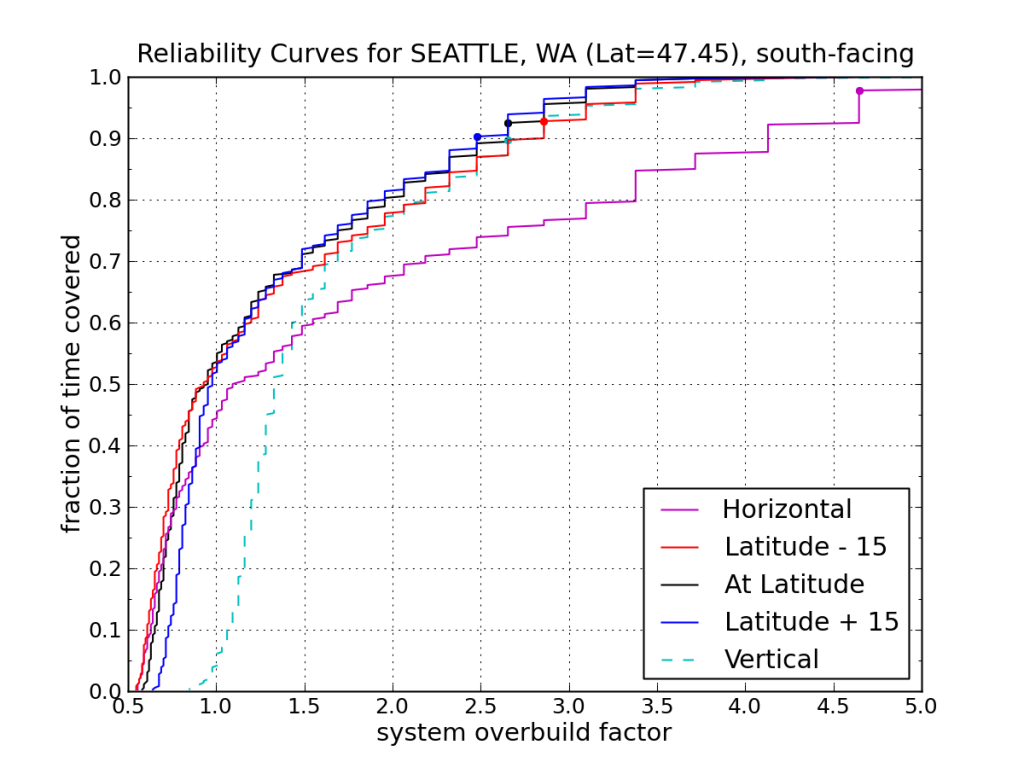 Seattle is an interesting case. The rising curves take their sweet time reaching the realm of reliability. But on the other hand, as long as you don’t lay the panel flat, it hardly matters what you do. In any case, we don’t hit reliable-land until a factor of 2.5–3 overbuild.
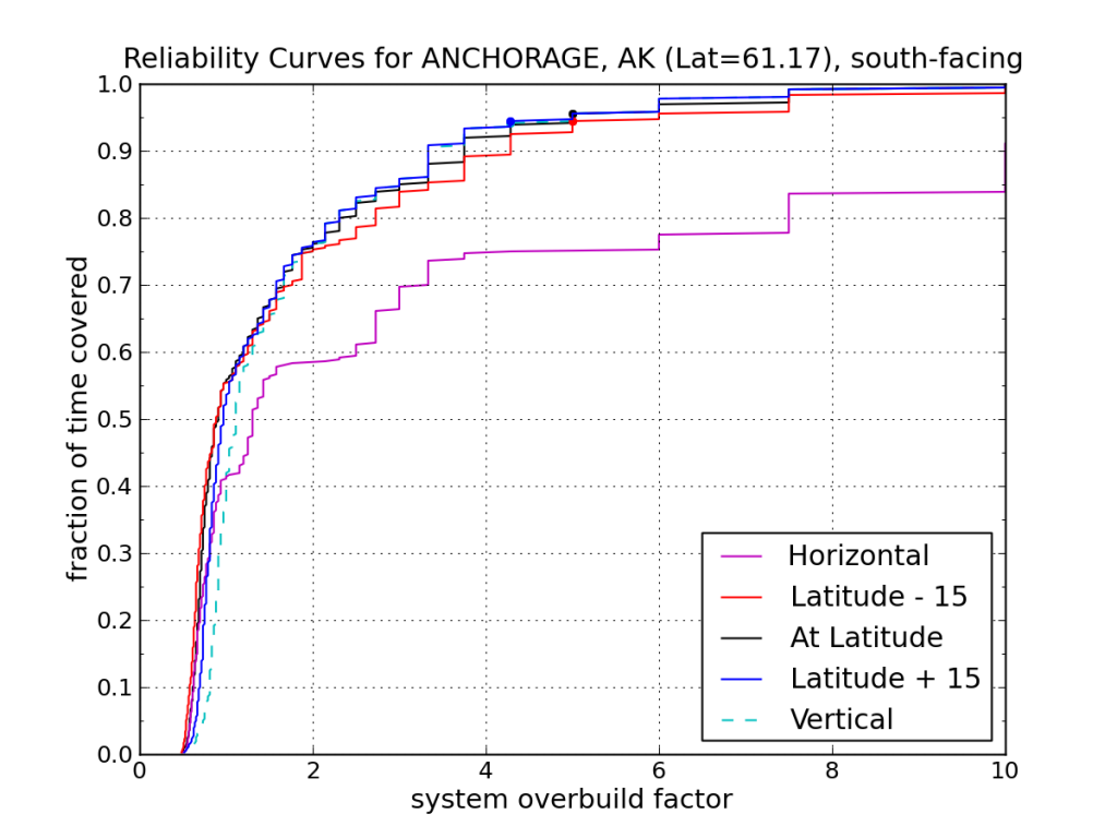 Anchorage, Alaska is a similar story—but more exaggerated. It hardly matters what orientation the panel is in, as long as it’s tilted up at least 45°. But you’ll need a 4× overbuild to cope with the worst of the winter months.
Note that in every one of the cases above, the latitude-plus-15° curves offered the lowest overbuild factor once into the range above 80% reliability. Over-tilting the panels pays off in the dismal parts of the year. Also, the dots based on the minimum reported month generally land in the 90–95% range.
All Together, Now
Seven down, 232 to go! Or why don’t I just put it into map form and hit everything with one swat?
Again using the annual average yield as the baseline, by what factor must we overbuild a system to get 90% or 95% coverage on a monthly basis? The map below shows the situation.
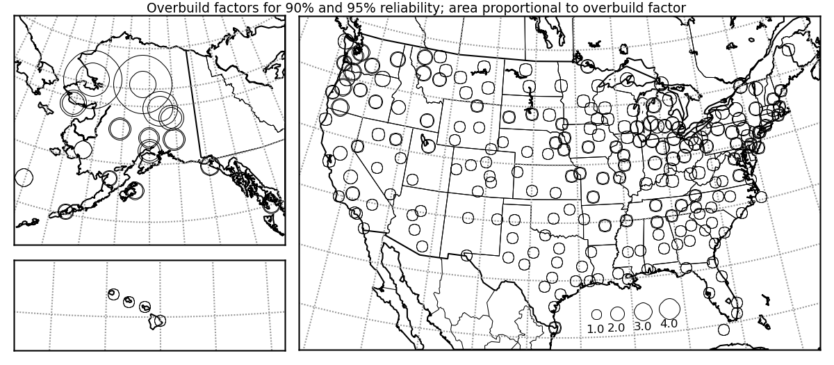 Less colorful than its cousins, each circle is area-scaled to represent an overbuild factor (legend appears in the Gulf of Mexico). For many sites, the two circles are indistinguishable. This suggests that 100% reliability is not far behind. But things go a little berserk in Alaska.
Let’s fold into this the differing annual yields as a function of location. What size array would you need to install to meet the same energy delivery requirement 90% and 95% of the time?
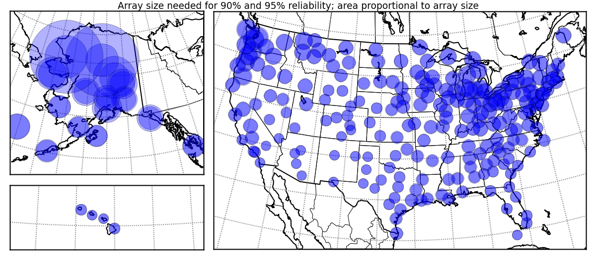 Again, the area of the circles scale with the size of the array needed. Now you see Alaskan winters taking their toll on year-round reliable performance. Too bad that off-grid is so Alaska—but at least northern Alaska isn’t having it.
Why Not 100% Reliability
Why did I stop short and satisfy myself with a mere 90–95% reliability? Well, the shallow slopes of the curves at the high end offer a hint. Filling in that last gap in reliability costs dearly in system size. My PV system at home keeps the batteries up to snuff about this fraction of the time. In dark times, I fall back on utility power. But what if I couldn’t do this?
It is a recent phenomenon that people live their lives not adapting to the whims of nature. Many of us run numerous aspects of our lives on a rigid schedule in disregard of the weather, the season, etc. We expect energy to be available 100% of the time and take it for granted. It was not always so, and it need not be true in the future. When energy runs a little short, it’s actually not that hard to modify behaviors to get through the crunch. Absolute rigidity and a 100% reliability requirement can push a stand-alone PV system into ridiculous proportions.
So relax. During a shortage, read a book by LED light rather than watching TV. Turn off the fridge (winter is the tough time, anyway) and store food outside or in a cooler garage. Cope. If only 5% of your time is spent in modified mode, how bad is this, really? The variety, challenge, and awareness of one’s resources can easily make it worthwhile. And a period of relative abundance is around the corner to make up for the shortfall. Just learn to ebb and flow, and you’ll feel more connected to the world as a result.
Hits: 2102

Alas, none of this helps when you have a tenth of an acre shaded by your neighbors trees.
We’re in the same boat. First of all, our climate is not particularly “solar friendly”. During the three coldest months of the year our solar insolation amounts to 1.30, 1.56 and 2.31 kWh/m2 per day (source: http://www.porta-energy.com/Insolation_USA.htm). To further complicate matters, our home is orientated east-west, our roof is punctuated by multiple dormers, and we’re shaded on the south side by a steep rock face and heavy tree cover. The situation is pretty much hopeless, so we’ve focused all of our efforts on energy efficiency.
Fortunately, there has been good progress on that front. For example, our Bosch dishwasher has an EnerGuide rating of 180 kWh/year (an average of 0.84 kWh/load) and our Bosch large capacity front loader is rated at 120 kWh/year (0.31 kWh/load). I’m guessing the twenty-some year old dishwasher and top loader that we had inherited with this home would have used three to four times as much electricity and hot water. And even though we’ve doubled our refrigerator capacity, the amount of energy required has been cut by half (the original refrigerator had an EnerGuide rating of 121 kWh/month or 1,452 kWh year, whereas the two replacements each consume about 0.95 kWh/day or 350 kWh a year. http://i362.photobucket.com/albums/oo69/HereinHalifax/Refrigerator-24hPowerUsage.jpg).
I wonder if you could come up with a smaller version of what some school systems do to lower their electric bills. Make ice in the day (with your peak solar) to keep you cool at night.
In the case of the schools, they are doing the opposite so that they can get the discount from the utility when their is unused (wasted) capacity in the system. The ice system (I think Trane is the mfct) is a relatively normal cenrtal coolant system with a very high delta T.
Hi Tom,
Excellent work as usual.
What does this look like for other places around the globe, specifically Africa? Most African nations are looking at building pretty substantial power generation in the coming years (for example Kenya, which forecasts going from 1500MW of generating capacity now to 20,000MW by 2030), and some have programmes in place to encourage renewable energy generation. Would be good to Do The Math on how this might look if done with renewables.
Have you come across any comparable databases/sources for global calculations during your research? (ie. not just the US?)
It seems to me that the question of how much to over-provision the solar array depends entirely on the cost of backup power.
If solar is cheap and batteries are expensive, then your best bang for the buck is to have just enough batteries to make it through your worst sunless period coupled with as much solar as you need to be sure the batteries are fully charged when that time comes.
But if solar is expensive and batteries are cheap, the opposite applies: have enough batteries to keep you going for weeks on end, and only enough solar to meet your long-term net usage.
With grid-tied systems, the “battery” is free, and it’ll even give you back more energy than you put into it. That completely changes the economic question…in very complicated ways not really worth going into. The shortest version is to divide 70 by the payback time and decide if you like that rate of return on your investment. A seven-year payback time (common and my own case) is equivalent to a 10% interest rate payment, which is phenomenal in any market and unattainable in today’s market; a 14-year payback (think Olympia) is still 5%, and more than banks are charging for mortgages or ever have paid for passbook savings that I can remember.
Incidentally, Tom, this touches on why I have such a problem with your seven-day figure for the nation-sized battery. In reality, I don’t see us needing more than a 24-hour battery, and really not even that much. Instead, we’d simply over-provision the solar grid to the point that, even on dark winter days, the national grid would produce at least 24 hours of power over any given 24-hour period.
Considering that, at least initially, our national battery backup is likely to be made from electric vehicles with smart chargers that backfeed on demand and that dead-of-winter production lows will be accompanied by don’t-you-dare-go-out-in-that winter storms (meaning more cars left in garages), it seems to me that it’s entirely a non-issue. That’s even more true when we start using solar electricity to produce chemical fuels; summer’s surplus gets burned in generators in the winter, and we only need enough capacity for the annual net (which, of course, will be higher considering the inefficiencies involved).
Cheers,
b&
According to the report below, only 9 states have an average payback period for residential solar installations of less than 9 years, and for the plurality of states it’s more than 15 years. And of course these periods would be longer without government “incentives” (i.e. subsidies). If demand increases, the subsidies will almost certainly be reduced, because the government simply cannot afford to give tens of thousands of dollars to every household. Also, I don’t know how you’re calculating your “rate of return.” Does it take into account the opportunity cost of your up-front capital investment? In other words, if you spend, say, $20,000 of your own money on a solar installation, you can’t invest it in, say, an IRA or a money-market account. That’s a cost to you and needs to factored into any caculation of returns.
http://1bog.org/blog/infographic-how-much-does-solar-cost/
Eh, not so much.
If we’re truly talking investment as opposed to capital or operating funds, all this means is that the solar investment is less liquid than more traditional financial instruments.
Remember, once you put money into that IRA, you can’t touch it until retirement anyway — not if you want to keep earning the dividends on the IRA. And you’ll be hit with significant penalties if you try to do so.
It’s not much different with solar in practical terms. If you really need access to those funds again, you can either use the panels as collateral for a loan (such as through a home equity loan leveraging the higher value of your home after installing panels), or you can sell the panels outright (presumably with the home as well).
If you have a dollar in your pocket, it’s not doing you any good until you give it to somebody else.
If you give it to somebody else in exchange for a solar panel, that panel will keep putting a penny or two in your pocket for a very long time, and you can give the panel to somebody else in exchange for (almost) a dollar.
If you give it to somebody else in exchange for a financial instrument, the same thing happens: they take your dollar, but give you a penny or two every now and again. You can (usually) get (most of) your dollar back from them for some amount of hassle, but that also cuts off the flow of pennies — just as when you sell your solar panel.
Of course, the income from solar panels doesn’t automatically directly compound, but there’s nothing that says that you can’t re-invest the wealth that the panels generate into something else that also generates a return on the investment. Again, that’s all that traditional instruments do — they pay you interest / dividends / whatever, and then immediately take the payment from you and deposit it right back into the account that earned the income. Solar doesn’t do that automatic re-deposit, but with automatic monthly deduction setups from your bank, you could do that easily enough yourself. Just automatically transfer every month what you would have paid the electricity company into a savings account, and there’s your monthly compounding interest on your solar investment. When you’ve got enough in that account to buy more panels…then lather, rinse, and repeat.
Cheers,
b&
You still haven’t provided a detailed description of your rate of return estimate. Given the findings in the report I cited, your claimed payback period seems unusually short. But the biggest problem with your estimate and your comparison to mortgage rates, etc. seems to be that you’re ignoring the role of government subsidies.
And even with the subsidies, it seems unlikely that many people are getting an effective return of 10%. I can also think of all sorts of potential problems and issues that are likely to make people reluctant to spend a large amount of money on a solar installation. For example, I think a big concern for most people would be that they may not be able to recover their costs when they sell the house. This is a common problem with any type of housing upgrade.
[edited]
If you really want details, Arizona Goes Solar is a collaborative effort led by the Arizona Corporation Commission and implemented by the electric utilities in Arizona. It provides information on every solar (PV and hot water both) installation in the state that has received incentives from the utilities. It was the biggest single factor that led me to pick the particular contractor that I did. My own installation is now buried in their dataset.
In my case, my contractor gave me all sorts of detailed charts and graphs that included upfront costs, maintenance, panel degradation, utility rate inflation, all the rest. And all of their assumptions — I went through each one — were overly pessimistic. I think they assumed 2% for utility rate inflation, for example, and 5% inflation for SHW maintenance costs.
I triple-checked all their math, and found no errors.
And the payback time was right in the seven year range.
If you remember the Rule of 70, that means I’m getting about a 10% annual return on my investment.
Why [is it that] residential rooftop solar needs to somehow account for government subsidies, but no other industry does?
Why don’t people complain that the airlines don’t account for the government-funded air traffic control system? Why don’t people complain that the food and drug industries don’t account for the FDA? Why don’t people complain that the auto industry doesn’t account for the interstate highway system? Why don’t people complain that the finance and again the auto industries don’t account for the bailouts they just received?
For that matter, why don’t people complain that people don’t account for the role that the mortgage interest tax deduction plays in their own personal finances?
Picking out solar, especially in this context, for receiving some sort of unfair special government subsidy is [misguided].
After all, the fossil fuel industry gets the biggest subsidy of all: they have free reign to pollute. They’re dumping gigatons of carbon into the atmosphere and thereby singly responsible for the greatest environmental catastrophe humanity has ever faced — and they’re not going to ever have to pay a dime to clean up the mess they’re still making. It’s awfully hard — nay, impossible — to top that sort of subsidy.
And…what, nobody ever takes a risk in any other sort of financial investment? Nobody ever loses in the stock market? Nobody’s 401K has ever lost value? No real estate investor has ever taken a bath?
The risks associated with solar are practically nonexistent related to the risks associated with just about anything else you can do with your investment money.
Cheers,
b&
I think it’s a bit disingenuous to pass lightly over the issue of energy storage. That issue is fundamental to those who are not supporters of solar power. Even taking your analysis at face value, solar power is not available at night. Where I live, the nights can be long and cold. (Still, I agree that for personal use, one can perhaps make choices that allow for low power needs in evenings and at night. But manufacturers that run night shifts? Hospitals?)
Having said that, I enjoyed your analysis (and your plots).
Even from the perspective of a mathematical exercise, I don’t think we can pass over the issue of energy storage. The data you’ve used is based on monthly averages. Over-engineering your panel size only works if you have energy storage. (Crude example: 15 days out of the month, the panels produce the desired total energy and 15 days out of the month, the panels produce none. The monthly average appears to be acceptable.)
Of course you are aware of this because you didn’t use the yearly average. But then, why not weekly or daily averages? In fact, how do we define the issue of reliability?
That’s an honest question, not a rhetorical one. I would assume that, without energy storage, we have to consider the instantaneous power produced. But maybe there are other reasonable possibilities. Maybe 1 s brownouts are OK a few times per day, but we have to over-engineer to make sure we never have 1 hr brownouts.
It’s your exercise, so how would you define adequate reliability?
Finally, there is something a little bit confusing (IMO) about the plots. At first, I thought you were indicating the physical size of the area required for solar power in each location. But each dot is intended to be relative in size, not absolute. It might be better to not plot the dots on the map, but rather just pull out a list of locations and put the dots in a column. Just my thought. Or I could ask that the dots be made absolute in size, with respect to the power requirements at each location but that’s probably complicating things…
I look forward to your posts! Thanks for your analysis.
Thanks for the comment. I’m certainly no stranger to storage challenges. See my post on the nation-sized battery, and how we don’t have enough lead in the world to make an adequate battery for the U.S. (given a seven day backup requirement).
This post was really meant to be an exploration of the NREL database: what it offers, what we can learn. The choice to go with monthly rather than weekly or daily values is simply a reflection of what the database provides: less about my choice. Indeed, daily is the appropriate scale for determining storage requirements.
Sorry the dot sizes were confusing. If I had used the actual size to cover demand, you would not even be able to see most of the dots! Solar is that abundant. Perhaps I’ll put a note to this effect in the post.
I fear you’re too cavalier about that 5%. For one thing, the distribution matters a lot. 5% every day would be 72 minutes every day — killer if actually during the day, insignificant at 3am as would be more likely. All in one bloc, it would be 18 days of no power.
More likely would be winter brownouts and price hikes. But also, when is energy most needed? As is, we use electricity more in the summer, with A/C. But if we stopped using fossil fuel heat, then winter heating would be the greatest use for many people, right when power is most short.
“So relax… The variety, challenge, and awareness of one’s resources can easily make it worthwhile”
I don’t think that’s very good marketing. More useful, though probably beyond the scope of this post, is comparing the cost of fuller overbuilding vs. the cost of having sufficient storage or backup generators, the latter probably running on relatively easily biogenic methane. Or a sufficiently capacious grid to redistribute southern winter power to the frozen north.
How do you perform your frequency analysis? Would you mind sharing your code?
Upon a more careful reading of your write-up, I figured out your methods. A few comments:
– Referencing the overbuild factor to the yearly average for the latitude tilt mixes the variability of the same month over the 30 years with the seasonal variability. This may not be the best metric to use when designing a system if you require a base minimum level of electricity in the winter. I suggest making a similar overbuild factor instead referenced to the worst monthly average for a location.
– Similarly, referencing all data to the latitude tilt does not necessarily produce meaningful results. If I were designing a solar power installation, I would first decide on the number of axis used to track (typically 0), and then the fixed angle tilt. Given that result, I would then look at the overbuild factor for that particular setup in order to gauge reliability.
– Since you’re a scientist, I’m sure you’re used to this scientific criticism of your analyses, although you may get frustrated with people who always want more (hence the future studies portion of many papers and presentations), but don’t fully consider the time and resources involved in additional research. Therefore, I went ahead and coded up my own version of the program so I can look at these metrics and apply them to other locations in the dataset without constantly badgering you.
-Thanks for this post and the inspiration. This is a fun problem to analyze.
“Relax” is going to be a nonstarter as a sales pitch – nobody wants to have to move their food outside during a power outage. And what if you’re travelling?
This is just lazy engineering since there are alternate means to achieve higher reliability. For example, can we build a freezer that uses even less energy in the winter by venting heat outside? And although electricity can’t easily be stored, perhaps we can make ice or just build a system with a lots of thermal inertia?
I expect that the profits will go to companies that actually solve engineering problems using clever designs rather than saying “you don’t need that.”
Is there any chance that these data are well enough calibrated over 30 years to determine something about change in cloudiness over the US? If so, the data might contribute to understanding of climate feedback due to clouds.
“That issue is fundamental to those who are not supporters of solar power.”
“Even taking your analysis at face value, solar power is not available at night.”
“not supporters of solar power” “solar power is not available at night” says to me that the fact that – sunshine is the only income we’ve got – hasn’t sunk in yet.
Tom did the math on mining the astroids and all that. It’s only going to happen in the movies. We can only live on savings for so long.
That big old fusion generator that sets out there 93 million away IS The Miracle Power Source. And it has come around every single day for the past 4-5 billion years. Talk about adequate reliability . What a deal.
The position that the American Way Of Life is not negotiable will probably be revised in the near future.
In 1946, the year I was born, 54.3% of American farms had electricity. http://www.rurdev.usda.gov/rd/70th/rea-history.pdf
We don’t take running water for granted out here on the farm.
Uh. We also have wind. Not as big and ultimately solar powered, but does run at night. And we have fission. Sunshine is *not* the only income we’ve got. It may or may not be the best, but it’s not the only.
It is obvious from our ongoing world economic drama, that there is a lack of agreement in our assessments of what is income, what is savings and what is debt. Debt should not be confused with income.
Wind, hydro, biomass and PV are ALL solar. Solar is constantly incoming.
Hydrocarbons and fissionable materials are stocks on hand. These stocks do work that is beneficial but, in the final accounting, the environmental liabilities of these energy sources must be paid. The environmental debt has been deferred but it will be paid. The Japanese are now paying on their debt for nuclear power. The climate disasters, current and future, are debits for burning hydrocarbons and current and future generations will pay that bill.
Life on Earth evolved on current solar income. When we introduced stored solar income and nuclear energy into the equation we started an experiment.
DO THE MATH makes it clear to me that this experiment leads to the end of civilization and probably human extinction. I don’t think you could call me a pessimist. Multiple times a year I pay good money for seeds and go out and bury them in the dirt, thinking that the Sun is going to shine and the rain will come and in the end I will harvest more than I planted.
Who would be fool enough to bet on the weather? That takes optimism.
Whether we can collectively face the truth before us that Tom has so elegantly presented, and then act to maintain a livable world for our children and grandchildren remain to be seen.
(NOTE: I should have said “sunshine in the only income we’ve got…. except for asteroids and meteorites”. Sorry.)
Different interpretations of the content I have written for Do the Math are certainly possible. But I should probably clarify that I very much doubt human extinction will be the result of our lack of wisdom. It’s true that our present civilization has been built on a limited-time-offer energy source. And a successful transition to a world without fossil fuels is far from guaranteed. So we run significant risks dismissing the challenges on our doorstep. But I have to pull up short of predicting the end of human civilization. It may be unrecognizably altered, and a crash may be difficult to avoid. But snuffing out civilization entirely is a much taller order.
I also suspend my judgment on the idea that human extinction is a foregone conclusion.
However, that the end result of such rapid growth to such dizzying heights is another mass extinction event seems distinctly within the realm of possibility – as a possible worst case for a run-away global warning scenario.
A short NOVA video:
http://www.youtube.com/watch?v=ENR2KNEAYEw
I think it is important to say that it isn’t pessimism to acknowledge the possibility that particularily nasty risks may exist as a result of the path we’ve walked for all these years – it’s just the unpleasant side of realism.
You compare fixed panel, one axis tracking, and two axis tracking, electing to go with fixed panel in the name of simplicity (and fewer failure modes). A sentiment I fully agree with. But what happens if you go somewhere in between, one axis “tracking” that consists of monthly or quarterly manual adjustments? This would not increase complexity, and the corresponding failure modes much, but would it be worth the extra work?
Ray
I actually practice this low-tech seasonal tracking, tilting my south-facing panels as the sun’s declination changes. An earlier mounting scheme of mine allowed tilts of 10, 20, 30, 40, and 50°. In practice, such efforts gain something on the order of 5%. Not the roughly 25% offered by one-axis tracking, but for the price, I’ll take it!
No mention of the pvwatts calculator at NREL? If you just want to see what an array of a given size will do in your area, it’s a pretty simple tool…. http://www.nrel.gov/rredc/pvwatts/
New discovery – cheaper solar panels;
http://arstechnica.com/science/2012/08/discovery-opens-door-to-cheaper-solar-panels/
Definitely an interesting approach. As with many of these things, it’s wise not to count chickens before they hatch. Articles about breakthroughs that will revolutionize solar power are almost as abundant as the solar resource itself. Lots of genuinely good ideas out there, but technical or fabrication barriers stand between the research result and the market.
Additionally, we’re already at the point where the installation (labor, mounting hardware, etc.) costs about as much as the panels. Reducing panel costs further would be swell, but we’re rapidly approaching the point where, in practical terms, solar is about as cheap as it’s going to get.
You’re never going to get around the fact that the panels are generating a lot of power, and that a lot of power will always pack a good wallop. We’re always going to need qualified electricians to do the wiring, just as we’ll always need qualified electricians to hook homes up to the grid. And, similarly, we’re always going to need inverters, breaker panels, wiring, and all the rest capable of safely handling that kind of current.
At the same time…just think of what it would take to safely install a coal-fired generator on your roof, or an oil rig in your back yard, or a nuclear power plant in your basement. By those standards, solar is already laughably cheap — well into the not-so-mythical-after-all “too cheap to meter” range.
Cheers,
b&
Perhaps one of the best things our tax money buys – NREL.
Here’s a little online database for PV design. Much of the data is useful in solar water heating design as well. See link:
http://rredc.nrel.gov/solar/calculators/PVWATTS/version1/
Thank you, Prof Murphy, for an enlightening essay on the practicalities of solar power. In particular, thank you for the advice (or commentary) in the last two paragraphs, the pith being «cope».
Not-too-remote history is still remembered in sayings that, although not in common speech today, we still come across: “Make hay in the sunshine.” “Trim your sails to the breeze that blows.” “It is ill sailing against wind and tide.” (My Dutch grandfather regularly dispensed this lattermost advice; sorry, I cannot recall the words in Dutch.)
About a century ago, the financially fortunate in the Midwest took steamers to Mackinac Island and its environs for R&R; in recent decades, many folks think little of crossing oceans and continents for a quick break. (I have done so a few times.) And I remember hearing a Brazilian, speaking half a century ago, of his fellow citizens who were intimately familiar with Paris and Provence yet found it natural that they new nothing whatever about the interior of their country, and were almost totally unaware of the sertão. In my church here in Chicago, hardly any of my by-and-large well-educated and well-traveled fellow parishioners have visited Fermilab (barely 40 miles to the west); many are quite unaware of its existence.
In one lunchtime conversation, back when I worked at the GM Tech Center north of Detroit, we talked about how much income a family needed to live a nice life; we surprised ourselves by how small that income was. One lunchmate observed that as a family’s income rises, the family typically does nothing new and novel, they simply do what they had been doing previously, only more expensively. I would venture that we could say the same about energy consumption, direct and indirect. Who was it that said that when our luxuries become our necessities, we merely become poorer?
I find it fascinating as well as amusing that one could solar power a house in Traverse City for not all so much more than it would cost to do so in San Diego. And the (Grand Traverse) Bay area produces some excellent wines!
http://www.ncsolarnow.com/?utm_nooverride=1&gclid=CJHkl6bk47ECFQmd7Qod2ksAkg
installed a 20-panel system on two roof sections of my house in June and to date (8/13) it’s produced over 1.37MwH of energy. What’s not used by our electrical load during daytime hours is fed back into the grid through a bidirectional meter, and credited against our regular consumption.
We DO have high winds and hurricanes here in Raleigh, NC, and the installers said that the panels, bolted down through the shingles into roof rafters, should be good for most of the winds that hit us here.
Hi Tom,
Thoroughly enjoyed the post. Love your work. I’ve been trying to determine the overbuild factor for a PV system in my home in New Zealand and found the following tool (http://www.niwa.co.nz/energy/update/energy-update-01-october-2010/how-much-energy-can-my-solar-panel-capture) published by a NZ Government research organisation based on climate data.
Not quite as good as your reliability curves but a good starting point.
Cheers
Stephen
I spent a bit of time at the online store “sunelec.com”, and I noticed that the cost of the inverters and battery chargers now exceeds the cost of the panels themselves. In fact, as a percentage of the whole cost, if you include installation as well, the panels are now less than 1/3 of the cost. This means that further improvements to the panel manufacturing costs alone will be of marginal use.
Well, I noticed something else. Supposedly, nickle-iron batteries are the best ones available for this type of application, because while their performance and efficiency is inferior to lead-acid, they don’t fail in 5 years. With an occasional electrolyte change, supposedly they have no upper limit on lifespan.
Well, this paper found a way to fix the iron electrode and possibly make a similar chemistry (iron-air instead of nickle-iron, which means better energy density if it works) practical. http://jes.ecsdl.org/content/159/8/A1209.full
I know, I know : if you had a gallon of gas for every paper like this you’d have a lifetime supply of gasoline. Still, it looks promising.
European and African readers should check out the Joint Research Centre’s nifty little interactive PVGIS tool:
http://re.jrc.ec.europa.eu/pvgis
You can adjust the location, orientation, size, technology etc and it’ll output the expected generation.